Understanding SC 2.5.8:Target Size (Minimum) (Level AA)
Status
This understanding document is part of the draft WCAG 2.2 content. It may change or be removed before the final WCAG 2.2 is published.
Intent
The intent of this Success Criterion is to help ensure targets can be easily activated without accidentally activating an adjacent target. When targets are small, it is difficult for users with hand tremors and those who have difficulty with fine motor movement to activate them accurately. Providing sufficient size, or sufficient spacing between targets, will reduce the likelihood of accidentally activating the wrong control.
This Success Criterion defines a minimum size; using larger sizes will help many people use targets more easily. Meeting 2.5.5 Target Size (Enhanced) is recommended whenever possible.
The requirement is for targets to be at least 24 by 24 CSS pixels in size. There are five exceptions:
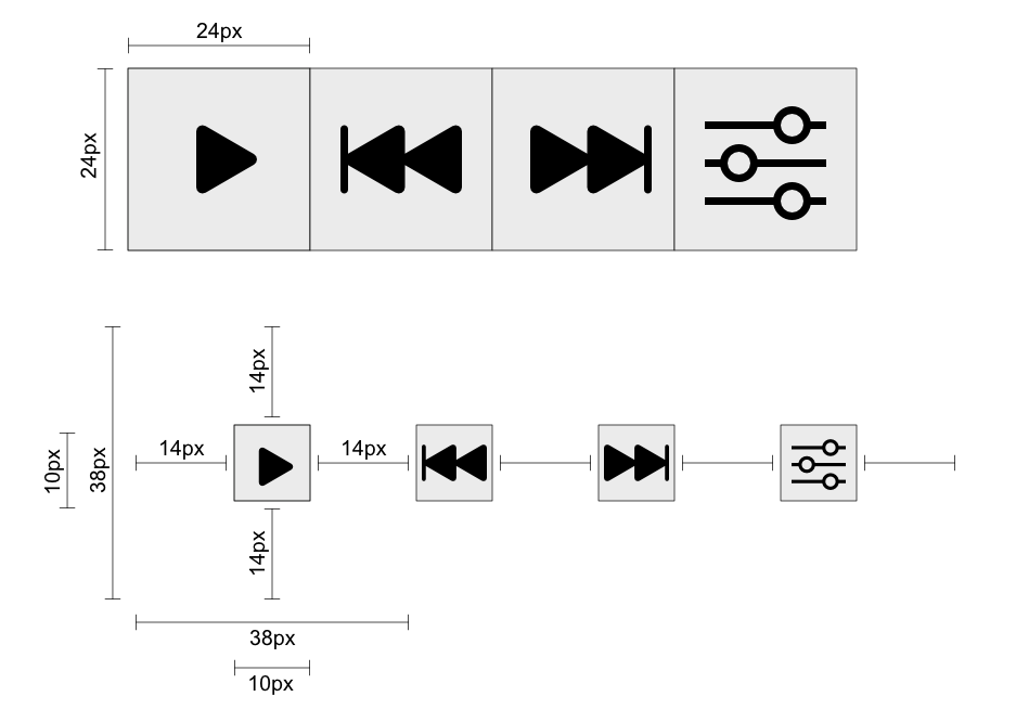
- If a target is smaller than 24 by 24 CSS pixels but has sufficient spacing, it passes. The spacing is sufficient if the offset between targets is at least 24 CSS pixels. Target offset measures the distance between targets, measured from the farthest point of one target to the nearest point of the adjacent target, and is assessed for each of the adjacent targets. What edge of the target is farthest depends on the relative position of the neighboring target. For example, if considering distance above the target, the farthest edge would be the bottom of the target, and the offset would be measured from this bottom edge to the bottom edge of the neighboring target above. Note that where the targets differ in size or shape, the offset between targets may also differ. The offset distance must be at least 24 CSS pixels in all cases to fall under this exception.
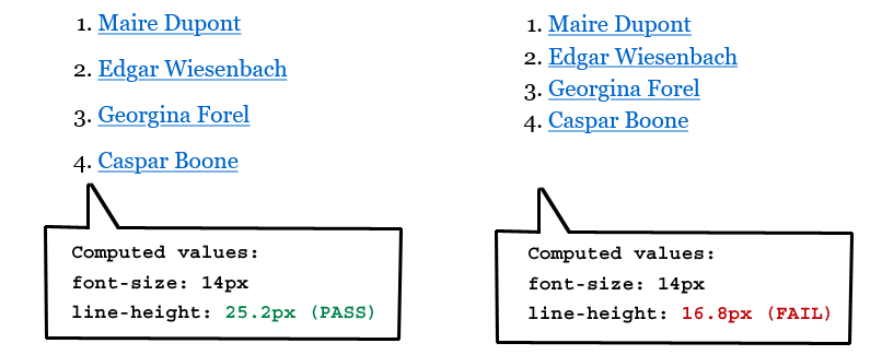
- The Success Criterion does not apply to inline targets in blocks of text – for example, text links inside a sentence or paragraph. This exception is allowed because text reflow based on viewport size makes it impossible for authors to anticipate where links may be positioned relative to one another. When multiple links are embedded in blocks of texts in smaller text sizes, maintaining a 24 CSS pixels offset between links in adjacent lines of text would require a large line height which can be undesirable in many design contexts. Also, inline numeric footnotes common in scientific texts may sometimes have a width well below 24 CSS pixels. Note: Stacked lists of links, as in navigation structures, do not count as inline links. Authors can anticipate the relative position of these links and accommodate sufficient target spacing.
- If the spacing of the targets is essential to the information being conveyed, the "Essential" exception applies. For example, in digital maps, the position of pins is analogous to the position of places shown on the map. If there are many pins close together, the offset between pins and neighboring pins will often be below 24 CSS pixels. It is essential to show the pins at the correct map location, therefore the Essential exception applies. As well, some jurisdictions legally require online forms to replicate paper forms, which can impose constraints on the size of targets. In such jurisdictions, any legal requirement to replicate small targets can be considered essential.
- Browsers have default renderings of some controls, such as the days of the month calendar
in an
input type="date". As long as the author has not modified the user agent default, the target size for a "User agent control" is excepted. - In cases where a target does not have an area equivalent to 24 by 24 CSS pixels, but there is another control that can achieve the underlying function that does meet the minimum area, the target can be excepted based on the "Equivalent" exception.
The requirement is independent of the zoom factor of the page; when users zoom in the CSS pixel size of elements does not change. This means that authors cannot meet it by claiming that the target will have enough spacing or sufficient size if the user zooms into the page.
The requirement does not apply to targets while they are obscured by content displayed as a result of a user interaction or scripted behavior of content, for example:
- interacting with a combobox shows a dropdown list of suggestions
- activating a button displays a modal dialog
- content displays a cookie banner after page load
- content displays a "Take a survey" dialog after some period of user inactivity
The requirement does however apply to targets in any new content that appears on top of other content.
While the Success Criterion primarily helps touch users by providing target sizing to prevent accidental triggering of adjacent targets, it is also useful for mouse or pen users. It reduces the chances of erroneous activation due to either a tremor or reduced precision, whether because of reduced fine motor control or input imprecision.
Spacing, alone and in conjunction with size, can improve user experience. There is less chance of accidentally activating a neighboring target if a target is not immediately adjacent to another. Touchscreen devices and user agents generally have internal heuristics to identify which link or control is closest to a user's touch interaction - this means that sufficient spacing around a target can work as effectively as a larger target size itself.
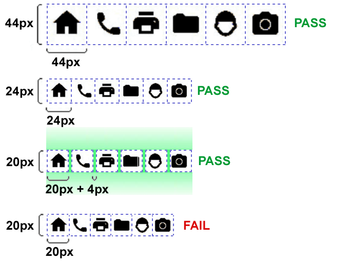
The following illustrate a variety of situations using size and spacing of targets. In the top line of icons, the dimensions of each icon target are 44 by 44 CSS pixels with no space in between. This amply passes this Success Criterion and is actually sufficient to meet the AAA requirement for Target Size (Enhanced). In the next row, the dimensions of each icon target are 24 by 24 CSS pixels with no space in between, passing this Success Criterion. In the third row, the the same icon targets are only 20 by 20 CSS pixels but they have a 4 CSS pixel space in between, passing this Success Criterion via the spacing exception. In the last row, the the same icon targets are only 20 by 20 CSS pixels and have no space in between, failing this Success Criterion.
When targets are not 24 by 24 CSS pixels, it is still possible to meet this Success Criterion. The next two illustrations show sets of buttons which are only 20 CSS pixels tall. In the first set, there are no targets immediately above or below the buttons, so they pass. In the second illustration, the buttons have been stacked on top of one another, resulting in a fail.


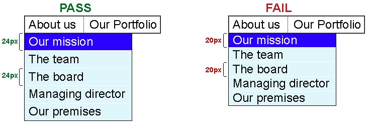
The following two illustrations show how menu items can be adjusted to properly meet
this requirement. In the first illustration, the About us
menu has been activated, showing that each of the menu item targets (text and padding)
has a 24 CSS pixel height. In the second illustration, the same menu is expanded,
but the menu items only achieve 20 CSS pixels in height.
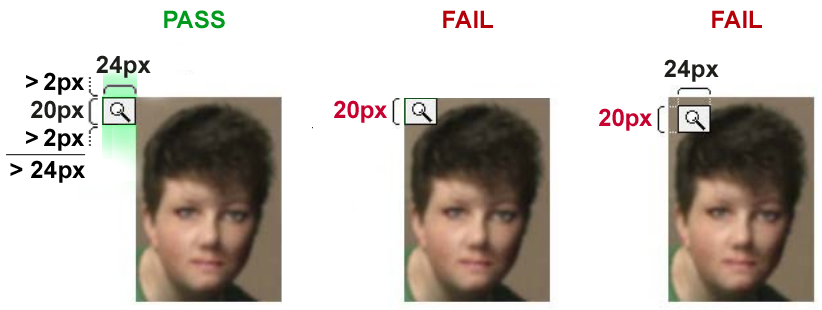
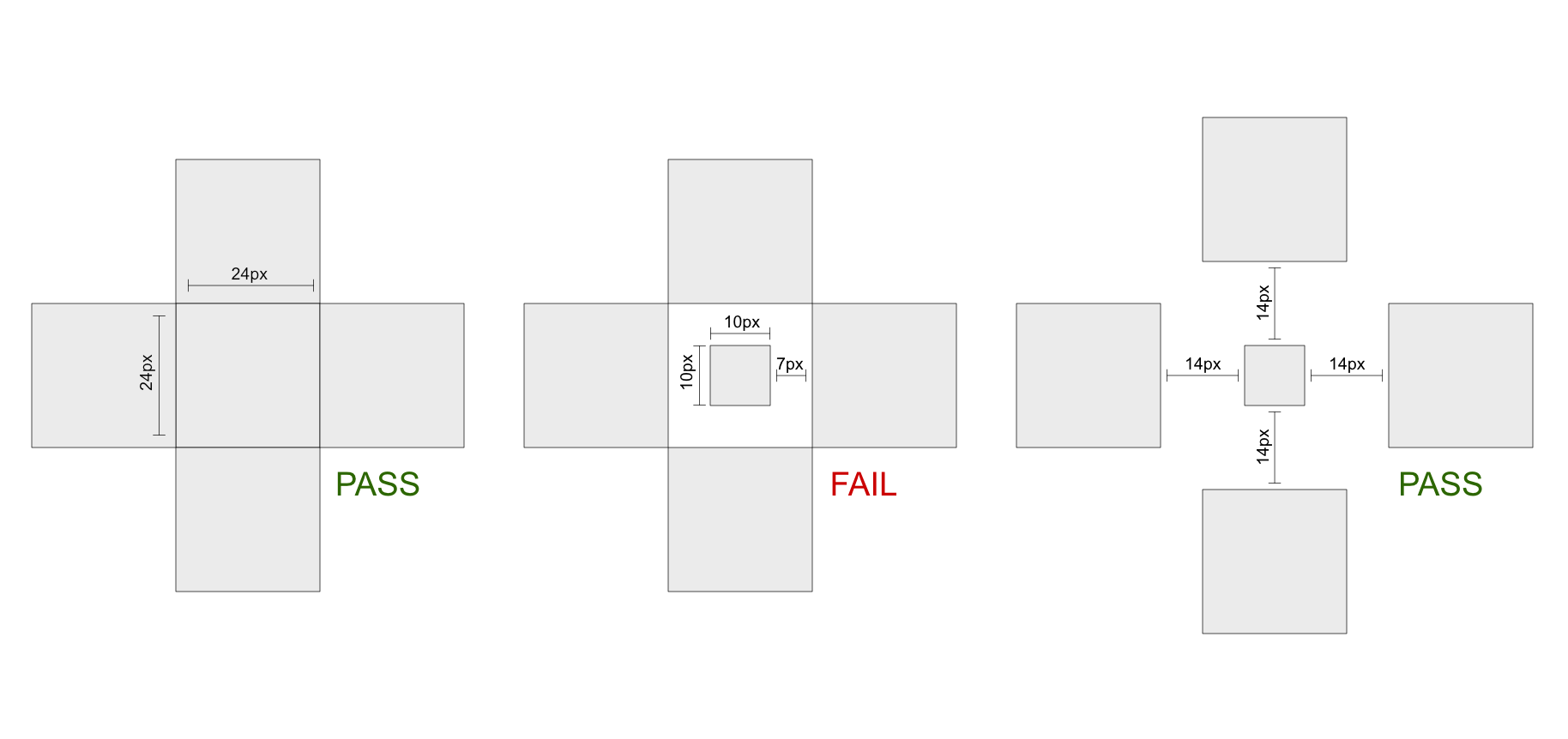
The following three examples illustrate how a target's position relative to another target affects the offset. Each illustration shows a person's profile image, which is a target leading to the profile page, as well as a magnifying glass icon, which opens a lightbox view of the profile image. In the first example, the magnifying icon is outside of the picture. Its horizontal dimension is 24 CSS pixels. The vertical dimension is below 24 CSS pixels but since there are no adjacent targets above and below, the target meets the Success Criterion. In the second example, the icon overlaps with the top-left corner of the image. The image, itself a target, is immediately adjacent to the magnifying glass icon. Measuring from the top of the magnifying glass icon to the nearest point of the image target shows that that the offset is only 20 CSS pixels. The second example therefore fails the Success Criterion. In the third example, the magnifying glass icon sits inside the linked image. Since it is surrounded by a larger target, the offset to the surrounding and immediately adjacent image target is only 20 CSS pixels at top and bottom. The icon target fails.
Users with different disabilities have different needs for control sizes. It can be beneficial to provide an option to increase the active target area without increasing the visible target size. Another option is to provide a mechanism to control the density of layout and thereby change target size or spacing, or both. This can be beneficial for a wide range of users. For example, users with visual field loss may prefer a more condensed layout with smaller sized controls while users with other forms of low vision may prefer large controls.
The aim of this Success Criterion is that targets are ideally at least 24 by 24 CSS pixels. However, the offset exception allows for smaller targets if there is sufficient spacing around them. Authors should be aware that using smaller targets can have an impact on layouts, as the combined space of the smaller target and the required spacing around it will generally require an overall area that is larger than 24 by 24 CSS pixels.
Benefits
Having targets with sufficient size - or failing that, sufficient target spacing - can help all users who may have difficulty in confidently targeting or operating small controls. Users who benefit include, but are not limited to:
- People who use a mobile device where the touch screen is the primary mode of interaction;
- People using mouse, stylus or touch input who have mobility impairments such as hand tremors;
- People using a device in environments where they are exposed to shaking such as public transportation;
- Mouse users who have difficulty with fine motor movements;
- People who access a device using one hand;
- People with large fingers, or who are operating the device with only a part of their finger or knuckle.
Examples
- Three buttons are on-screen and the target area of each button is 24 by 24 CSS pixels. Since the target size itself is 24 by 24 CSS pixels, no additional spacing is required, the Success Criterion passes.
- A row of buttons, each of which has a horizontal width of more than 24 CSS pixels, but a height of only 20 CSS pixels. Since there is sufficient spacing above and below the row of buttons, the Success Criterion passes.
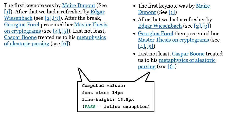
- Links within a paragraph of text have varying target dimensions. Links within paragraphs of text do not need to meet the 24 by 24 CSS pixels requirements, so the Success Criterion passes.
Related Resources
Resources are for information purposes only, no endorsement implied.
Techniques
Each numbered item in this section represents a technique or combination of techniques that the WCAG Working Group deems sufficient for meeting this Success Criterion. However, it is not necessary to use these particular techniques. For information on using other techniques, see Understanding Techniques for WCAG Success Criteria, particularly the "Other Techniques" section.
Sufficient Techniques
Key Terms
if removed, would fundamentally change the information or functionality of the content, and information and functionality cannot be achieved in another way that would conform
input device that can target a specific coordinate (or set of coordinates) on a screen, such as a mouse, pen, or touch contact
See also Pointer Events pointer definition [[!pointerevents]].
region of the display that will accept a pointer action, such as the interactive area of a user interface component
If two or more touch targets are overlapping, the overlapping area should not be included in the measurement of the target size, except when the overlapping targets perform the same action or open the same page.
New
the distance measured from the farthest point of a target (A), to the nearest point of the second target (B). The offset includes the target and spacing around the target. The offset from A to B may be different than the offset from B to A, if the sizes of these targets differ.